
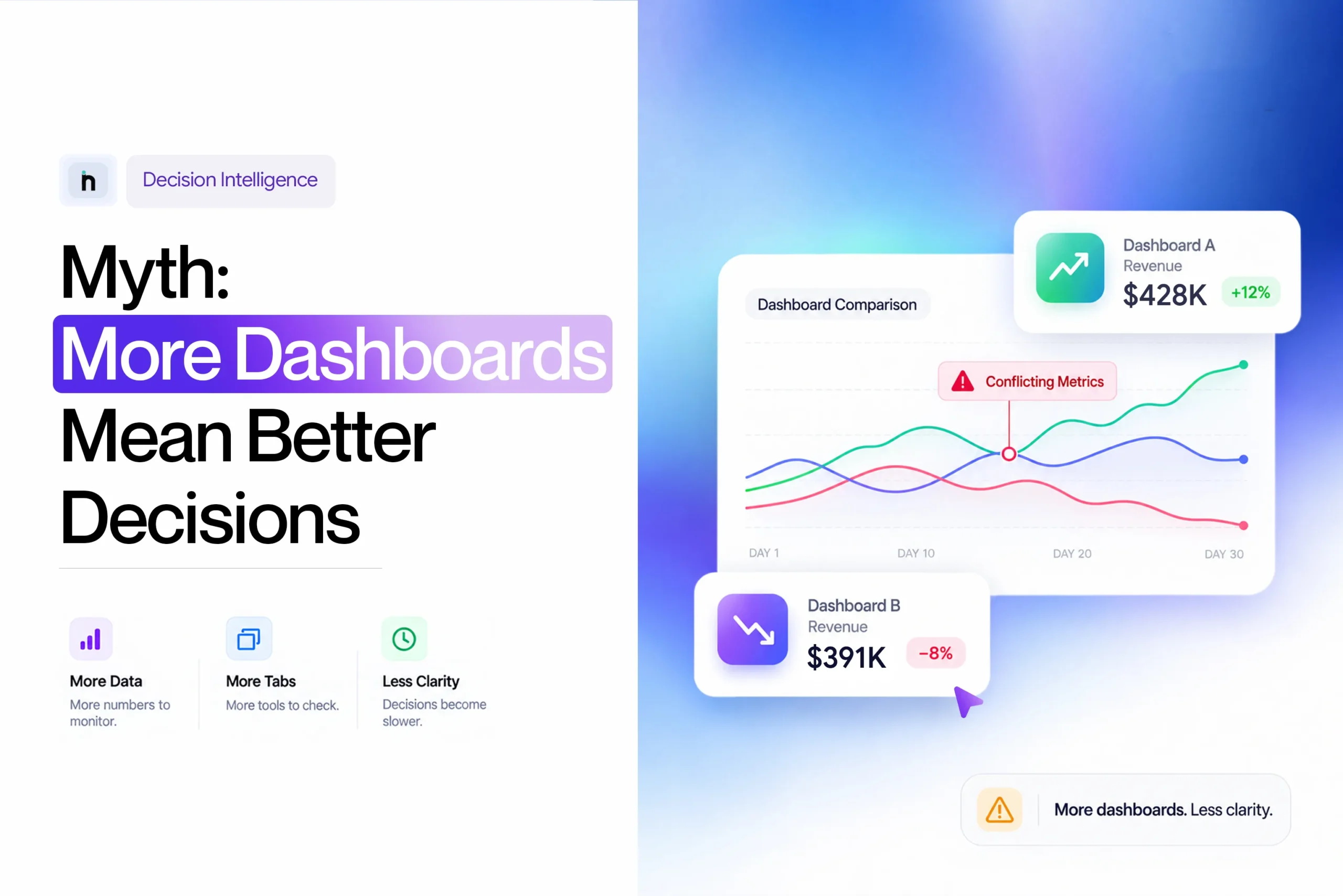
Shopify Analytics indicates revenue growth. The Meta Ads Manager reflects a better ROAS; Google Ads – more conversions; and the GA4 platform indicates an increase in traffic.
On the surface, it seems like a great week.
But then comes finance. It turns out that the cost of customer acquisition was higher than planned, the number of discounts has grown, and the contribution margin moves in the wrong direction. The ecommerce team mentions that two of the most popular goods from the assortment of the store were out of stock during a week.
Suddenly, the issue is no longer about whether there is enough information. Numbers abound.
The truth issue lies in recognizing which numbers speak the truth about what is going on in the business and how they link up together. This is where the idea that having more dashboards means making better decisions begins to crumble.
A business intelligence dashboard(scaleboard) can make complex information easier to use. It can transform raw data into visual representation, organise KPIs, indicate trends, and provide each department with a convenient tool to monitor their performance.
The limitation lies not in the concept of the dashboard but rather in the conventional design of the dashboard, which involves presenting information and allowing the user to make connections, determine the issue, evaluate the financial impact, and define how things should progress.
Decision-focused reporting interfaces can do a lot more. For instance, Scaleboard by NetSights is built on the concept of intelligence cards that go from data to diagnosis and proposed next steps. Some of the cards currently used in Scaleboard can help identify what changed, outline contributing factors, present an estimated cost of delay, and propose further investigation/changes.
Thus, the solution does not lie in eliminating the dashboards.
It lies in not mistaking more reporting interfaces for better decisions.
Data is never a problem for e-commerce. The issue lies in the fragmentation of data across multiple channels, with each channel providing an isolated insight.
Sales and orders are provided by Shopify, whereas the performance of paid advertisements is provided by Meta Ads and Google Ads. GA4 includes some signals from the website and acquisitions, while CRM, retention, inventory, logistics, payments, and finance add to the picture.
All of these channels provide valuable information on their own, but they cannot account for your performance.
A drop in revenue might result from less traffic, poorer conversions, AOV decrease, higher cost of acquisitions, stock issues, refunds, changes in customer composition, and so forth. You know what is happening by looking at a decrease. Knowing why necessitates a deeper level of analysis.
NetSights combines all ecommerce performance data into a cohesive picture allowing marketers to see the interconnection of marketing, products, customer base and store performance.
The core of this is Scaleboard, which offers more than just KPIs through providing context on changes, possible reasons behind them, their potential business impact, and future considerations.
In case the revenue decreases from $120,000 to $104,000, a conventional dashboard will reflect the change easily. Scaleboard would be useful for correlating the change with associated triggers including conversion rates, advertising spendings, stock supply, and refunds.
There are other features of NetSights, designed for such a workflow. For instance, iSight will allow for further analysis, Netification will highlight important KPI changes and notifications, and Netty will make it possible to raise questions.
What makes the solution valuable is the ability to work with more data and connect it.
A BI dashboard is a graphical interface where selected business data and KPIs are combined in one reporting environment.
It means that the person looking at a huge Excel spreadsheet will see charts, scorecards, tables, comparisons, and trends.
If you consider an ecommerce firm, the list of data for business analytics could be like that:
The benefit is obvious; a human will understand the change much faster from visual rather than transactional data.
When revenue is down for the last six weeks, then the trend will be clear on a line graph. When one channel is generating a significantly higher CAC than another, then the comparison would reveal it. When conversion suddenly spiked after updating the website, then the time frame might be clearer.
A classic dashboard would be great at answering:
However, advanced analytics platforms would go beyond that.
Rather than concluding with “ROAS decreased”, the intelligent reporting system would allow the users to make connections between ROAS, spend, revenue, channel performance, and conversion and customer economics.
This is even more crucial when talking about the issue of dashboard overload, since the problem is not really about visualisation. The problem is about how much manual interpretation is necessary after visualisation.
A dashboard does not need to explain the entire business to be valuable. In fact, trying to make one screen answer every possible question is often where the trouble begins.
There are several situations where dashboards are especially effective.
An effective KPI dashboard can enable a founder, CXO, or growth head to get an insight into how the business is doing without the need for diving into every single system that the company uses.
The point here is that being focused is important.
Whereas the founder needs to know about revenue, conversion rate, blended CAC, blended ROAS, AOV, contribution margin, and revenue from repeat customers, a performance marketing team would need more granular data on spend, CPM, CPC, CTR, campaign ROAS, frequency, and creative performance.
Both are relevant, but they are relevant to two different sets of people making different kinds of decisions.
This is why a CEO’s dashboard should never be just a downsized version of the marketing dashboard. It has to be built around decision-making owned by the executive level.
It goes the same way with weekly metrics that founders need to look at in their e-commerce business. The idea is not to measure fewer things. The idea is to ensure that the things we measure are truly connected to business health.
Dashboards become even more useful after the company determines what needs to be investigated.
Consider, for instance, that CAC has risen for four weeks in a row.
Now the team has a focal point. It can analyze the CPC, conversion rate, channel composition, number of orders made by new customers, AOV, and performance of the campaign.
The dashboard helps answer a particular question rather than force the user to go through all metrics to find anything interesting.
Sometimes a one-off figure is not sufficient.
It might mean that conversion is lower than it was yesterday but still fine in terms of its 30-day performance. It can indicate poor week-over-week repeat purchase revenue but still be much better than it was a year ago.
The power of data visualization dashboards lies in this ability to put movements into perspective.
It allows teams to avoid panicking about each and every fluctuation in figures.
The finance, marketing, operations, and e-commerce teams do not always have to have dashboards that look alike.
For instance, finance might need to see details on margins and cash impact, performance marketing may need to see more on acquisitions.
Having multiple dashboards does not automatically mean there is poor reporting.
The difficulty arises when the views fail to link up into a bigger picture.
Imagine an ecommerce situation that isn’t that uncommon.
An owner sees that yesterday’s sales are off by 15% compared to the anticipated range.
Shopify confirms the drop, but doesn’t give the reasoning right away.
GA4 is checked. Sessions are steady, so traffic volume most likely is not the problem.
Meta Ads Manager reveals that spend grew a bit while the attributed sales declined.
Google Ads don’t look unusual.
The ecommerce performance dashboard reveals that the conversion rate decreased overall.
Someone realizes that checking product availability might shed some light on the situation, revealing that there was no supply for two top-converting items for several hours.
Now the story starts to make sense.
Traffic wasn’t that unstable, conversion rates dropped along with unavailable products and continued spending.
All of this information was available to the ecommerce business from the beginning. The trouble was that the answer was spread between several reporting platforms and had to be pieced together manually.
That’s what I would call dashboard overload.
It’s one of the reasons why even with so much more data available, an ecommerce company feels more flooded by the data than empowered to make decisions.
The problem cannot always be solved by getting rid of dashboards. The solution, rather, lies in minimizing the manual work needed in connecting the dots from those dashboards to the business question.
The number of dashboards alone does not tell you whether reporting has become too complex.
The symptoms are more useful.
Revenue can be found in Shopify, GA4, Meta Ads Manager, BI dashboard, and finance reports.
CAC might show up in the marketing report, founder dashboard, and the monthly finance model.
It’s not a problem to see the same metric more than once, as long as everyone knows what each one means.
The problem occurs when no one really understands why the figures are different.
If the first 15 minutes of the weekly review is devoted to discussing which one to use, Meta revenue, Shopify revenue, or the BI report, the team is having problems with their metrics definition.
Another classic dashboard will not help in that situation.
It requires a more sophisticated reporting layer.
This can become an even more valuable signal.
A dashboard was created to ease the process of analysis. In case, the data is still exported by the team, cleaned up manually, and added into three more reports before creating a new spreadsheet where a decision is made, there should exist some space in between reporting and decision making processes.
For businesses that face such a challenge on a regular basis, ecommerce reporting automation becomes a more useful solution than any additional visualization.
An individual logs into his dashboard for some other purpose and realises that conversion has dropped for three consecutive days.
A business owner happens to look at his stock of products and finds out that one of his top selling products is about to run out.
These examples indicate that while the company might be good at reporting, it certainly has issues with exception prioritisation.
This is where intelligence solutions such as anomaly detection, ordering or alerts come into play.
KPI turns red.
Dashboard has reported the problem successfully.
And then what?
If people still have to log into multiple systems to correlate relevant signals, assess the potential damage, and assign responsible parties, there remains a huge distance to travel from visibility to action.
One such aspect where the Scaleboard approach varies is the inclusion of costs of delay in decision-making, according to NetSights.each card follows a data → diagnosis → recommended action structure and can also include an estimated cost of waiting.
One of the primary reasons for confusion in dashboards is the fact that the same business metric is measured differently in various systems.
Let’s consider revenue.
Shopify tracks transactions made in the stores.
GA4 reports purchase revenue on the basis of the ecommerce events sent to Analytics.
Meta Ads Manager and Google Ads can measure revenue using their own attribution models.
Finance may have its own approach considering the refund, cancellation, tax, or any other adjustment to revenue.
None of the above approaches has to be necessarily “incorrect”.
They may just be addressing different questions.
The same problem exists when it comes to measuring CAC, ROAS, conversion rate, repeat purchase rate, new customer revenue, or lifetime value.
Consider the customer acquisition cost.
The paid media dashboard may track CAC based on advertising costs only. Finance may want to take into account agency fees and creative costs.
If these calculations are not marked clearly, two teams can debate the CAC even if both calculations are mathematically correct.
This is the reason why taking CAC and LTV into account together gives more context than seeing one of these metrics as a stand-alone score.
It is not always good when CAC is low because the acquired customers may have low retention and low contribution margin.
Similarly, a good platform ROAS does not necessarily make the business more profitable.
One advantage of the connected Scaleboard model is the possibility to do calculations of blended metrics instead of depending only on the single number from one platform. Currently, NetSights offers cards for blended ROAS, CAC, ad-spend efficiency, LTV per channel, inventory risk, retention and other cross-platform signals.
Once dashboard overload develops, the consequences go beyond an untidy reporting stack.
|
Reporting problem |
What happens |
Why it matters |
|
Duplicate KPIs |
Different reports show different versions of revenue, CAC, or ROAS |
Meetings turn into reconciliation exercises |
|
Too many metrics |
Every number competes for attention |
Important changes become harder to notice |
|
Data silos |
Marketing, finance, and operations work from separate views |
Teams optimise their own area rather than the whole business |
|
Manual reconciliation |
Reports are repeatedly exported and rebuilt |
Skilled time is spent preparing analysis instead of using it |
|
Passive monitoring |
Problems are only found when someone checks |
Issues may continue for hours or days |
|
Vanity metrics |
Easy-to-improve numbers dominate reporting |
Activity can look strong while profit weakens |
|
Missing diagnosis |
A metric changes without connected context |
The team still has to find the cause |
|
No action layer |
Insight ends with the chart |
Detection does not automatically lead to a next step |
A simple test can reveal a lot:
If this dashboard disappeared tomorrow, which decision would become harder to make?
If nobody can answer clearly, the dashboard may be reporting information without supporting a meaningful decision.
The useful comparison is not dashboard versus intelligence.
It is traditional descriptive reporting versus a decision-oriented reporting layer.
|
Traditional business intelligence dashboard |
Decision-oriented Scaleboard |
|
Shows selected KPIs and trends |
Combines KPIs with diagnosis and context |
|
Help answer “What happened?” |
Help answer “What changed and why does it matter?” |
|
User looks for unusual movement |
Important changes can be prioritised |
|
Often organised around data sources |
Organised around business decisions |
|
User manually connects metrics |
Cross-platform signals can be connected |
|
Business impact may require further analysis |
Cost-of-inaction can be surfaced |
|
User decides what to do next |
Recommended action can sit alongside the insight |
|
Best for reporting and exploration |
Best for moving from reporting towards action |
NetSights characterizes this difference with the phrase “Dashboards show data. Scaleboards make decisions.” NetSights’ existing Scaleboard is based on marketing, product, customer, and store intelligence cards, which integrate data, diagnosis, and action.
Let us look back at the revenue example.
A standard dashboard could tell you:
Revenue decreased by 12% yesterday.
Useful information, but you still have to figure out why.
An analysis-based dashboard would give you:
Traffic was consistent, but the conversion rate dropped.
Now the search is narrowed down.
An intelligence card for scaleboards can go a step further and consolidate all these signals within the context of the decision being made:
The revenue went down with traffic steady. Conversion deteriorated for high-traffic products; but the paid spend stayed above its previous value. This problem is costing about X dollars daily, so find out product availability and conversion issues before spending more.
What really matters is not where the data is presented.
It’s how far it drives the person to make a decision.
Not at all.
This is yet another key point.
Classic BI dashboards are still great for exploration, segmentation, historical comparison, reporting, and analysis.
If a growth analyst needs to compare the performance of 40 campaigns during eight weeks, the dashboard is the right choice.
If a merchandiser needs to analyze SKU performance in categories and time periods, the dashboard is useful.
If finance needs to analyze margin trends for product groups, the visual reporting is still relevant.
The issue is the assumption that each founder or CXO will conduct such an analysis prior to understanding where attention is needed.
A good analytics stack can leverage both.
The Scaleboard enables the focus on where attention is needed.
Dashboards enable the investigation of what needs to be known.
This combination is more powerful than using any of them as a substitute for the other one.
Not really, and that’s an important difference.
Once an organisation understands its reporting is fragmented, the logical step would be to create one huge unified ecommerce dashboard.
Shopify, GA4, Meta and Google Ads, customer data, inventory, and finance are all brought together in one place.
As far as the technical aspect is concerned, it has been all incorporated.
However, if the dashboard now includes 60 charts, then the problem of the amount of attention hasn’t gone away. What we’ve done is solve the login problem, and maybe the problem of having to look in too many places, but not necessarily the problem of decision making.
Data quality is an important part of that foundation. The NIST Research Data Framework highlights attributes such as accuracy, completeness, relevance, reliability, and consistency across data sources when assessing whether data is fit for use. A single source of truth therefore depends on the quality and consistency of the underlying data, not simply on bringing everything into one interface.
In case of more complicated ecommerce businesses, this is when the data warehouse for D2C brands comes into play.
The data foundation answers:
Where should our trusted numbers come from?
The reporting layer answers:
How should we visualise them?
And the intelligence layer answers:
What do these connected signals mean for the decision in front of us?
These are related problems, but they are not the same problem.
This process of beginning with the decision is increasingly necessary in light of the increased automation of the analytics process. In fact, Harvard Business Review has pointed out that quick analysis can result in poor results if the questions being asked are not the right questions, and thus suggests starting with the decision.
If you are asking how to build a KPI dashboard, the easiest mistake is to begin with all the data you have available.
Start with the decision instead.
Complete this sentence:
“This dashboard helps [person] decide [something].”
Example:
“This dashboard helps the growth head decide whether paid acquisition spend should increase, decrease, or stay the same this week.”
This immediately provides more focus than:
“This dashboard tracks marketing performance.”
If the decision is to increase spending on acquisitions, the following metrics might be needed: blended cost per acquisition, blended return on advertising spend, conversion rate, average order value, contribution margin, and customer value.
They are not necessarily all required at the dashboard level.
The information can be available lower down in the reporting structure.
Document the formula, data source, time period, and owner for every important KPI.
A consistent, boring number is far more valuable than a beautiful chart nobody trusts.
This is where modern reporting outshines the classical method.
Do you want your card to just say:
ROAS declined by 18%
or do you want it to elaborate on:
ROAS declined due to an increase in Meta spend without an increase in revenue, while Google was flat.
And what about the next step:
Reallocate some of the spend tomorrow to the more efficient channel and assess the results after the next period.
The more the interface digs deep into analysis and action rather than observation, the less manual interpretation gets passed back to the user.
Before adding more intelligence, make sure the data feeding it is reliable.
The10-point ecommerce data analytics checklist is useful for checking whether tracking, integrations, metric definitions, and reporting processes are ready to support more advanced analysis.
Not every KPI needs to be manually inspected every day.
Suppose conversion rate has behaved normally for the last three weeks.
There may be very little value in a founder opening the same report every morning simply to confirm that it still looks normal.
If conversion suddenly moves far enough outside the expected range, that is different.
Now the metric deserves attention.
The same logic can apply to revenue, ROAS, CAC, advertising spend, inventory, refunds, or payment performance.
This is where anomaly-first reporting and alerts change the workflow.
Instead of:
Open dashboard → Scan metrics → Find unusual movement → Investigate
the process can become:
Important movement is surfaced → Context is added → Team investigates or acts
NetSights currently applies this idea across its Scaleboard and Netification layers. The Scaleboard brings intelligence cards into one board, while Netifications can push priority performance signals through channels such as WhatsApp, Slack, and email.
There is an important warning here: more alerts are not automatically better either.
If every minor fluctuation produces a message, dashboard fatigue simply turns into notification fatigue.
The point is prioritisation, not volume.
In this case, there is a critical caution: more alerts are not necessarily good either.
If all fluctuations create an alert, then dashboard fatigue simply becomes notification fatigue.
The essence of the matter is prioritization, not quantity.
There is no ideal number of dashboards, and there is no law that states all companies should have a mature intelligence layer.
The best solution depends on the complexity of the company and decisions that need to be made.
In the case of a smaller ecommerce company with few channels, stick to a simple reporting stack. In this case, a dedicated ecommerce dashboard with trusted KPIs would be sufficient.
If you have different marketing, ecommerce, finance and operation departments, having multiple operational dashboards makes sense. Leadership metrics need to have consistent definitions in order for the company to operate on the same business truth.
If you spend lots of time generating weekly reports, automate data collection before adding more charts. Reporting should help in analysis, not do the majority of it.
If leadership meetings frequently start with “which number is correct?”, prioritize metric definitions and your single source of truth.
If you discover problems too late, use anomaly detection, intelligent prioritization or quicker alerts on KPIs for which a delayed reaction has a material impact on the bottom line.
If you already generate insights from your current dashboards – you might already be running a Scaleboard rather than a BI.
That final distinction matters most.
This article is not arguing that dashboards are inherently limited because they use a visual interface.
It is argued that passive reporting alone is limited.
NetSights consolidates ecommerce data from various sources in one linked visualization to help teams understand how things are going and take action where necessary.
Scaleboard plays a major role here.
Instead of operating like a standard KPI dashboard, this product currently relies on intelligence cards for marketing, product, customer, and store performance. All the cards follow the same principle – visualize data, explain what happened, and suggest an action to take. In addition, NetSights offers blended cross-platform indicators as well as an estimated cost-of-inaction.
A sample intelligence card on the Scaleboard page demonstrates the approach using blended ROAS. Instead of just showing the ROAS value, the card connects this change with Meta and Google performance, and also suggests taking some budget actions and estimating daily cost of delay.
This is exactly why the difference between these two approaches must be clearly outlined in the article.
This is not about “dashboard = bad; intelligence = good”.
This is about whether the reporting interface ends at performance or goes further to diagnosis and action.
iSight aids this intelligence layer by aiding in the analysis of performance and related signals.
Netification takes this intelligence beyond the board to push performance changes and priority signals to channels like WhatsApp, Slack, and email.
While Netty enables teams to converse with business performance and start an investigation with a question rather than a filter.
These layers transform the function of the Scaleboard.
It is not just another place for ecommerce data viewing.
It is meant to aid the business in moving from:
Data → change → diagnosis → commercial impact → action
However, dashboards will always be an integral part of ecommerce reporting. They provide teams with performance monitoring opportunities as well as possibilities for trend analysis and understanding what is going on within certain areas. The issue is that teams are often forced to navigate across multiple reports and reconcile their differences on their own in order to be able to determine what should be looked into.
Improved reporting is definitely not about showing more data charts on another screen. The point is to make it easier to see the links between the numbers, see which changes make sense, and focus on next moves.
This is the approach that is taken by NetSights Scaleboard. Not only does it show one view of connected ecommerce performance signals but it also adds some context regarding meaningful changes, their possible business impact, and the things that should be done next.
As a result, your team will be able to devote its efforts not just to report checking.
See What Matters. Know What to Do Next.
Bring your ecommerce performance into clearer focus with NetSights Scaleboard.
A: A business intelligence dashboard is a visual reporting interface used to monitor business data and KPIs. It typically uses charts, scorecards, tables, and comparisons to make complex information easier to understand.
A: Yes, although there is no fixed number that qualifies as “too many”. The problem begins when the reporting environment creates more work than clarity through duplicated KPIs, conflicting definitions, constant tool switching, or repeated manual interpretation.
A: Decision intelligence connects business data with analysis and decision context. Instead of only showing that a KPI changed, it helps establish what else changed, why the movement may matter, what the commercial impact could be, and where the team should focus next.
A: An executive dashboard should contain a focused group of KPIs tied to leadership decisions. For ecommerce businesses, this may include revenue, contribution margin, blended CAC, blended ROAS, conversion rate, AOV, retention, and significant product or inventory risks.
A: A traditional dashboard typically focuses on showing metrics, charts, and trends. A Scaleboard is designed to take the analysis further by connecting performance signals with diagnosis, business impact, and recommended action.
A: No. Different teams can use different dashboards while still relying on the same trusted data foundation. What matters is that shared KPIs have consistent definitions and the organisation understands which metric should guide which decision.
We write about growth, retention, and the numbers that actually predict what happens next for D2C brands. Have a topic you'd like us to cover? Get in touch .
Your ecommerce store already contains the answers. Learn how AI ecommerce analytics helps founders ask business questions, understand what changed and why, and move from scattered data to clearer decisions.
Your ecommerce store already contains the answers. Learn how AI ecommerce analytics helps founders ask business questions, understand what changed and why, and move from scattered data to clearer decisions.
Your ecommerce store already contains the answers. Learn how AI ecommerce analytics helps founders ask business questions, understand what changed and why, and move from scattered data to clearer decisions.